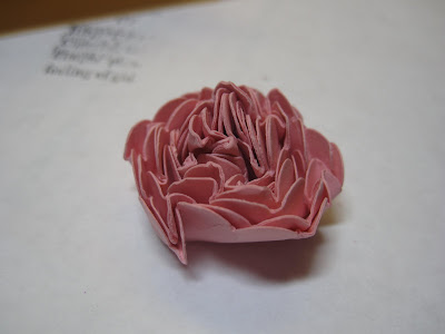
There are lots of scallop flower instructions out there- most of them tell you to punch 9 scallops, wet the cardstock, wrinkle it up one at a time, then stack the wrinkles flowers up, make a hold in each, put the brad in then unfold blah, blah blah. You know me- impatient as all get out. I can't wait for anything if I don't have to. Life is too short. So this is my version.
 So this is my version.
I saw a lot of 9 scallop versions- but if you are using stampin' up CS it is really pretty sturdy and I found 6 scallops to be much easier on my hand. Besides, for my classes, one quarter sheet punches out 6 scallops so it was easier math then to try to figure out a third sheet per person.
The look of punched book or manuscript is also widely popular so here is my version using the Define life stampset. No one really looks at the words so I just stamped one definition a bunch of times on a sheet -like a brick wall -as shown on left.

Punch out six scallops.

I've done it with flowers all wrinkled up before hand one by one like people said and just crisp cardstock straight from the punch, stacked up, pierced and brad placed in center- and you know what?- It is not enough of a difference that I care to wet it and wait for it to dry. It seems to work just fine either way.
 When I did it just straight, just pierce the hole, add the brad and just really scrunch it up into a ball. A lot of people in my class were so gentle- I say - just scrunch it up. Don't be so gentle. It can take it.
Then do the next layer and the next.


Until you get this kind of an ugly little ball of layers.

Then you loosen it up a bit, and it's as pretty as it gets, with 6 little pieces of punched up paper.
I've used glue dots and dimensionals to stick it and both work fine.

This is what it looks like when you use only 3 layers with a button from Button Latte Designer buttons tied wtih a hemp twine.

You can sneak a look at the brad holding it in, but if you scrunch it well or use 9 layers, it is much harder to see it. If you wanted it to show you could use a rhinestone brad or a halfback pearl from the pretties kit, some seed beads etc. Imagine how it would look in orangish paper with black or brown center like a poppy.
Sponge the edges or spray with shimmer paint diluted with alcohol, so many possibilities.

This is a card CASE'd from Dawn McVey using Stampin'Up instead of Papertr*y products and still oh so pretty.....
The motif is stamped repeatedly using an image from Tiny Tags.
Rose red CS and DSP with 1/2 inch strip of paper stamped with a note of thanks from Thank you Kindly set. I like to have the ribbon effect of the strip raised slightly and tacked down like a real banner- see some of the pictures above.
Try it out
Lynda
No comments:
Post a Comment