Sunday, August 26, 2018

Impossible Card


 I had my class make this impossible card on one of our classes.  Base is Rich Razzleberry with Share What You Love DSP on top and whisper white layered with Pear Pizazz.  Layered with flower punched out from Pop of petals and layered with dimensionals, topped with a little Pearl Basic Jewel. So much fun.

You can find the direction at Splitcoast Stampers Tutorials by Dina Kowal  https://www.splitcoaststampers.com/resources/tutorials/impossiblecard/
Have fun with it.  So many possibilities!

Friday, August 24, 2018

Love you to Pieces


I have a weakness for puzzle pieces.  Everytime I  see one of these dies I have to get it so of course when Stampin' Up came up with this one I had to add to my ever growing collection. BUt his is a really cute one. I used the base real red cardstock with a piece of whisper white and then the zigsaw pieces in Real Red.  I would advise that you tape the back of the pieces while they are still in the die so they don't go everywhere.  Just make sure you leave the tape behind one of them off so you can make it pop.  I then embossed the sentiment in versamark and heat embossed in silver and colored in the little flower and leaves with markers.  Put piece of powder pink ribbon on the back and some puzzle pieces diecut in same  then punch out the leaves with the Leaf punch - sort of like the sample in the catalog. Line the inside of the card with a piece of whisper piece and put the one piece of the puzzle that you left out on the inside.  How sweet is that?  I like the polka dot ribbon they used in the sample in the catty- love that little baby's breath type of look that it creates....

Wednesday, August 22, 2018

Blow out the Candles catalog case


Is this not the most fun die cut ever?  I knew I was going to get it as soon as I saw the sample in the catalog. My card is more reverse but love the little confetti pieces. Base is whisper white with a layer of Real Red diecut with the Candles & Confetti framelits dies on two sides. Tie the silver ribbon ( retired) - diecut the circle scallop from Layering Circles Framelits and the circle from the Stitched Shapes.  Stamp the cake and base on a scrap piece of whisper white, stamp the color - real red and Lemon Lime  and die cut.  Stamp the sentiment in red and use dimensional to put it on.  Add some clear rhinestones and easy peasy birthday card that is just SO CUTE!
Many color combinations work so choose the birthday gal/guy's favorite colors and go at it!
One of my favorite die from the whole kit and caboodle is this confetti die.....

Monday, August 20, 2018

Broadway Birthday


This card is just so me.  I love the sign shape and i love that deep pink and black and gold combo.
I always want to have a birthday card as part of the pack I have for my stamping parties and this was one I had for one of my last parties. 
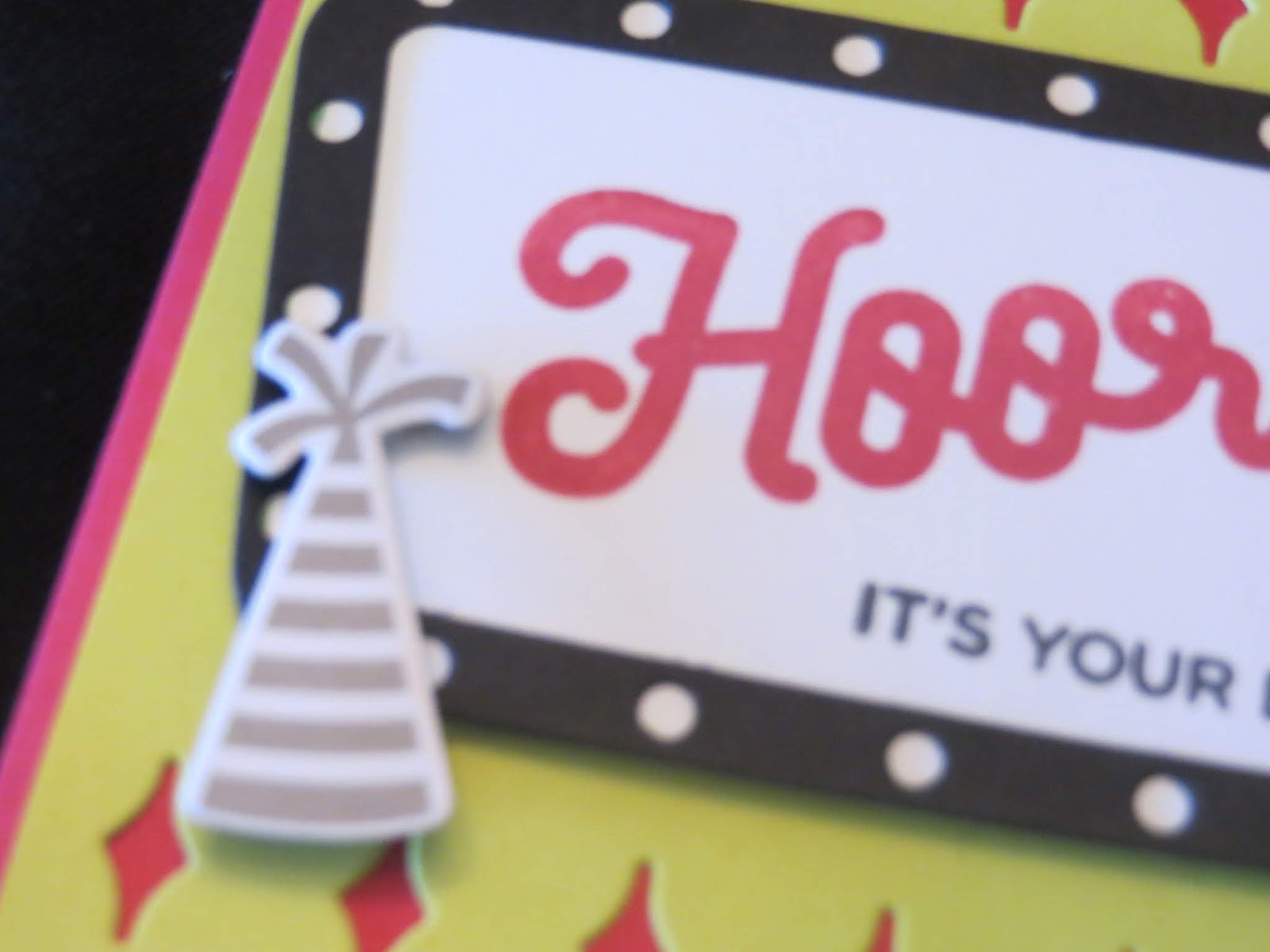
Base is Lovely Lipstick with a layer of Lemon Lime Twist diecut with the little twinkle border on both sides.  Die cut the frame in black.  Now this is where I wish Stampin' Up had a diecut for the white piece underlying it all because I had to free cut it so that I would get the white dots all around.
 Stamp the sentiment in Lovely Lipstick and Pacific Blue , and cut a strip of DSP with the gold sparkles and a hat from the piece of hat DSP- I had a strip that I had everyone cut which ever one they wanted. The die was perfectly sized to do that or you could have stamped your own hat using the stamp as well. I love having a choice!  The balloon stem is from the set stamped with the pacific blue but I wanted more a balloon shape so I used the Balloon Bouquet punch for an easy balloon mounted with dimensionals.  You could put clear rhinestones for someone special all around - that would be nice.

Saturday, August 18, 2018

Varied Vases catty case


On the corner of the main catalogue I saw this little card using the flowers from the Varied Vases and thought "how sweet is this?"  and thought to case it for a card and this is it.  Base is Petal Pink and then a layer of calypso coral.  Stamp the flowers in the same and Daffodil Delight to create your own personal DSP. Add a band of Sahara Sand CS diecut using the Stitched Labeled Framelits to create the cute little stitching, then  another layer of Calypso coral and Happy Friend from the Darling Labels punchbox.  Stamp it again in Daffodil and cut it out and use dimensionals to pop it up.  The flowers are retired stampin up.  Still cute, right?

Thursday, August 16, 2018

Varied Vases class project


This was a very simple card for my class using the Vases Builder punch.  Base is Cherry Cobbler, with a layer of Crushed curry on top.  ON whisper white stamp the left vase and the orchid stem and the vase to the right and the flower and color them in with Stampin' Blends. 
Stamp and punch out the two vases on the right. Figure out where you want to put the middle vase and stamp then draw in the stem.  Stamp the sentiment.  Lay down the 5/8" Burlap ribbon on the bottom of the left vase then lay the right vase down on top directly then use dimensionals to pop up the middle vase.  Add a highlight on the vase using a white gel pen. 

Tuesday, August 14, 2018

Color Your Season Morning Glory colors


I know this is available only for one month but it is an amazing set. I really LOVE the mutliple flower image that fills the whole card and it is not too difficult to fussy cut if you want to make it pop.  The 3 dies are amazing and I love the rolling leaves stamp too.  The little ribbon die is as sweet as it can be and in Highland Heather cardstock, really elegant.
 I diecut the shimmer CS first then stamped the flowers in the middle piece then I stamped the leaves on the outer piece.  Put the pieces where they may and used dimensionals to place the outer frame then used plain tape to stick the center piece directly onto the base white CS to make the outside pop just a bit.

After spending all that time coloring the flowers I thought it  a shame not to be able to show it so I stamped the sentiment onto a 1" strip of vellum with Versamark and heat embossed it using the white embossing powder.  then cut a piece of the pale purple ribbon with the die .  Add two pearls on either side of the vellum and then put a glue dot behind the pearls to hide the glue dot because it is visible. Mount the whole thing onto a whiper white cardstock.
                                                                                                                                                                   

Sunday, August 12, 2018

I hope Stampin' Up is listening....


I am getting old.  I can't seem to see a darn thing without my glasses and God knows I have more than 20 of them lying about the house but can't find one when I need it - only to find that it is on top of my head all along.   So I have this little complaint about the Stampin' Blends.  The top is the way it used to be labeled.  So dark I can't make out what the color or shade it is without some magnifying. 

Then they improved it by making it a little lighter so it is easier to see- that's the middle one.  Now I do see that there is one of those bars for scanning on it that is a large patch of white.  I think they need to do that with the name of the color and the shade.  Sometimes when I see a lone marker on its side I can't tell if it is calypso coral or pumpkin pie, or ivory or Crumbcake Light.  so I took the label maker- and finally figured out how to use the smaller font deal - and printed out the names and put one on both sides of the blends so I can see it without having to have my glasses. 
It was a pain in the butt to label it all so I'm hoping that Stampin' Up will take old folks like me into consideration and label the markers with larger black font on a bright white space on both sides of the markers.